By using a Graph::Button node it is possible to create simple controls in order to interact with the user. The Button graph node itself does not contain any visible elements; it only defines an area within the scene which reacts on mouse clicks and touch events.
Version 1: Simple Button
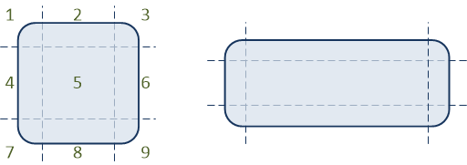
Button Node
We start with a default project and define a Graph::Button node with id="button01" within the XML file graph_main.xml. The size of the button is defined by sizeX and sizeY and its position by posX, posY and posZ. Since the button does not contain any geometry, it is transparent. In order to make the button area visible, we define a Graph::PlaneGeometry node on the same position and with the same size. Finally, we pack everything into a Graph::Transform node with id="transform01".
<?xml version="1.0" ?>

<Graph>
  <Instance graphResourceId="package_main:graph_mat"/>
  <Instance graphResourceId="package_main:graph_camera"/>
  <MaterialState materialId="material/mat_color_alpha"/>
  <FixedParameters id="par_color01" diffuseColor="149i, 185i, 200i, 128i"/>
  <ParametersState parametersId="par_color01"/>

  <Transform id="transform01">
    <Button id="button01"
      sizeX="200" sizeY="100"
      posX="0" posY="0" posZ="0"
    />
    <PlaneGeometry id="plane01"
      scaleFactorX="200" scaleFactorY="100"
      posX="0" posY="0" posZ="0"
    />
  </Transform>
</Graph>
Control Events
We need to specify a Logic::ButtonNode member variable within the program code in order to react on button events. In order to rotate and move the button within the scene, we define three further member variables additionally.
    Murl::Logic::ButtonNode mButton01;
    Murl::Logic::TransformNode mTransform01;
    Double mAngle, mZPos;
The new variables are initialized in the constructor and in the OnInit method.
App::ButtonsLogic::ButtonsLogic(Logic::IFactory* factory)
: BaseProcessor(factory),
mAngle(0),
mZPos(0)
{
}
...
Bool App::ButtonsLogic::OnInit(const Logic::IState* state)
{
state->GetLoader()->UnloadPackage("startup");
Graph::IRoot* root = state->GetGraphRoot();
AddGraphNode(mButton01.GetReference(root, "button01"));
AddGraphNode(mTransform01.GetReference(root, "transform01"));
if (!AreGraphNodesValid())
{
return false;
}
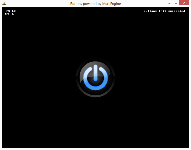
state->SetUserDebugMessage("Buttons Init succeeded!");
return true;
}
...
The variable mButton01 can now be used to query the button at every tick about event changes. We simply print the current tick time as user debug message at every button press.
    void App::ButtonsLogic::OnProcessTick(const Logic::IState* state)
    {
        Logic::IDeviceHandler* deviceHandler = state->GetDeviceHandler();
        //Double tickDuration = state->GetRecentTickDuration();

        // Exit
        if (deviceHandler->WasRawKeyPressed(RAWKEY_ESCAPE) ||
            deviceHandler->WasRawButtonPressed(RAWBUTTON_BACK))
        {
            deviceHandler->TerminateApp();
        }
        // Button01
        if (mButton01->WasReleasedInside())
        {
          state->SetUserDebugMessage("Button pressed "+Util::DoubleToString(state->GetCurrentTickTime()));

          const Vector& pos = mButton01->GetEventPosition();
          Debug::Trace(Util::DoubleToString(pos.x) + "/" + Util::DoubleToString(pos.y) + "/" + Util::DoubleToString(pos.z));
        }
    }
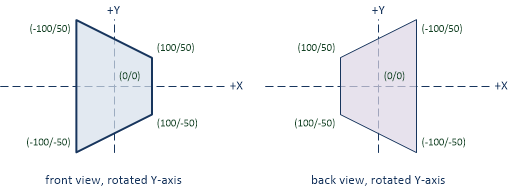
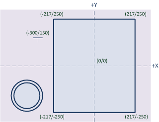
Additionally, we print the position on which the button press was made as debug trace. We get the position values from the GetEventPosition method. These values correspond to the local position on the button with the value 0/0 in the center of the button. In front view the values for right/top are positive and the values for left/bottom are negative.
The following applies for our 200x100 sized button:
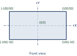
Even if the button is transformed within the scene and does not have a size of exactly 200 pixels, we always get the correct values. If e.g. our button performs a 180° rotation about the Y axis (back view), the values for right/top are changed to -100/50 and the values for left/bottom to 100/-50.
For a better understanding, we expand the code in order to rotate and move the button within the scene. By pressing F1 and F2 the Z position of the button should change and by pressing F3 and F4 the button should rotate. Furthermore, pressing the R key should reset the initial state.
    void App::ButtonsLogic::OnProcessTick(const Logic::IState* state)
    {
        Logic::IDeviceHandler* deviceHandler = state->GetDeviceHandler();

        if (deviceHandler->IsRawKeyPressed(RAWKEY_R))
        {
          mAngle = 0;
          mZPos = 0;
          mTransform01->SetPositionZ(mZPos);
          mTransform01->SetRotation(0, mAngle, 0);
        }

        if (deviceHandler->IsRawKeyPressed(RAWKEY_F1))
        {
          mZPos += 10;
          mTransform01->SetPositionZ(mZPos);
        }
        if (deviceHandler->IsRawKeyPressed(RAWKEY_F2))
        {
          mZPos -= 10;
          mTransform01->SetPositionZ(mZPos);
        }

        if (deviceHandler->IsRawKeyPressed(RAWKEY_F3))
        {
          mAngle += 0.05;
          mAngle = Math::Fmod(mAngle, Math::TWO_PI);
          mTransform01->SetRotation(0, mAngle, 0);
        }
        if (deviceHandler->IsRawKeyPressed(RAWKEY_F4))
        {
          mAngle -= 0.05;
          mAngle = Math::Fmod(mAngle, Math::TWO_PI);
          mTransform01->SetRotation(0, mAngle, 0);
        }
        ...
If the button rotates by more than 90°, we can see that the backside of the button does not react. The activeFaces attribute can be used to change this behavior to e.g. FRONT_AND_BACK.
The following values are valid:
FRONT_ONLY(default)BACK_ONLYFRONT_AND_BACKNONE
By default the button does only react to the left mouse button. The attribute mouseButton can be used to switch to a different mouse button.
The following values are valid:
LEFT(default)RIGHTMIDDLENEXTPREVNONE
On touch devices, the button reacts always to touch events regardless of the set mouseButton value.
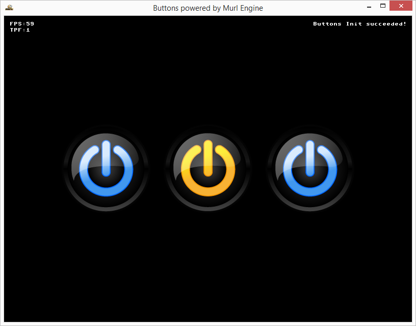
Version 2: Enhanced Button
As a next step we enhance the Button with suitable graphics. Different button states should be visualized with different graphic images.
Button State
The Button node does not contain any geometry and has therefore no appearance. The optical appearance can be designed with arbitrary node elements suiting your application.
Buttons support the automatic switching of its appearance for different button states. For that purpose, a node has to be defined for every button state (upState, downState, hoverState, disabledState) and connected to the button node via attribute values. The button node activates the correct node depending on the button state and as a result automatically changes the appearance of the button.
- Note
- Caution! Every state needs to get its own node assigned, as on state changes the connected node will get activated and all others will get deactivated. Using the same node for two states is not possible, but using two references to one node for two states is.
The connection between visualization nodes and button states can be done via the order index starting at 0 or with the unique name (node id). Alternatively, it is also possible to define the visualization of the state change via a timeline.
Button Resources
For our tutorial we create images of a round power button and visualize the different states with different colors. By means of the Atlas Generator tool we create a texture atlas and a plane XML file from individual graphics. For a detailed description about the use of the Atlas Generator tool please see Tutorial #02: Atlas Demo. At this point it should be noted that by calling the scripts/atlas_generator script a texture atlas will be created in the data/packages/main.murlres/gfx directory from the individual images in the data/orig directory.
Both new files are listed in the package.xml file.
<Resource id="gfx_powerbutton" fileName="gfx/gfx_powerbutton.png"/>
<Resource id="planes_powerbutton" fileName="gfx/planes_powerbutton.xml"/>
We create a Graph::FlatTexture node in the graph_materials.xml file and instance the sub graph which is defined in the planes XML file.
<FlatTexture
  id="tex_powerbutton"
  imageResourceId="package_main:gfx_powerbutton"
  pixelFormat="R8_G8_B8_A8"
  useMipMaps="false"
/>

<Instance graphResourceId="package_main:planes_powerbutton"/>
As the material namespace node has set the attribute activeAndVisible="no", its child nodes are not processed and the instantiated PlaneGeometry nodes of the planes XML file are not rendered.
In order to render the button graphics we use Graph::Reference nodes. A Reference node is a reference to another node in the scene graph. If the Reference node is set active, this reference is followed while processing the scene graph. Reference nodes are light weight and only need a small amount of memory. Therefore, if possible, Reference nodes should be chosen over Instance nodes.
Button State Assignment by Child Index
The assignment via the child index can be made by using the following attributes:
upStateChildIndexdownStateChildIndexhoverStateChildIndexdisabledStateChildIndex
Using this method the visualization elements have to be defined as direct child elements of the button node. The assignment can be done with the order index of the child nodes starting at 0.
For our power button we add four reference nodes as child nodes to the Button node and define which graphic is shown at which state via the ChildIndex attributes. Beforehand, we need to make sure that the correct material and the correct texture is enabled.
  <MaterialState materialId="material/mat_alpha_texture"/>
  <TextureState textureId="material/tex_powerbutton"/>

  <Transform id="transform01">
    <Button id="button01" sizeX="182" sizeY="182" shape="ELLIPSE"
      upStateChildIndex="0" downStateChildIndex="1"
      hoverStateChildIndex="2" disabledStateChildIndex="3"
    >
      <Reference targetId="material/powerbutton-up"/>
      <Reference targetId="material/powerbutton-down"/>
      <Reference targetId="material/powerbutton-hover"/>
      <Reference targetId="material/powerbutton-disabled"/>
    </Button>
  </Transform>
Since our button image is round and not rectangular, we adjust the shape of the button with shape="ELLIPSE". The default parameter for the shape attribute is "RECTANGLE".
As a result we get a round button which changes its color depending on the button state.
Button State Assignment by Node Id
An assignment with the node id is made analogously by using the attributes:
upStateNodeIddownStateNodeIdhoverStateNodeIddisabledStateNodeId
Using this method any node in the scene graph can be used, i.e. they do not need to be direct child nodes of the button node.
  <Transform id="transform02" posX="-200">
    <Reference id="up" targetId="material/powerbutton-up"/>
    <Reference id="down" targetId="material/powerbutton-down"/>
    <Reference id="hover" targetId="material/powerbutton-hover"/>
    <Reference id="disabled" targetId="material/powerbutton-disabled"/>
    <Button id="button02" sizeX="182" sizeY="182" shape="ELLIPSE"
      upStateNodeId="up" downStateNodeId="down"
      hoverStateNodeId="hover" disabledStateNodeId="disabled"
    />
  </Transform>
Button State Assignment by Timeline
A visualization via a timeline can be made by using the following attributes:
timelineIdtimelineIndexupStateTimedownStateTimehoverStateTimedisabledStateTime
The Timeline node can either be defined using the node id and the timelineId attribute or using the order index of the child nodes and the attribute timelineIndex. The corresponding EndTime values for the states can be defined with the StateTime attributes. If the button state is changed, the Timeline is set to the given EndTime and the Timeline is started.
To illustrate the usage we generate a button which visualizes the state changes via the size. To do so, we first create a new XMLAnimation resource file.
<?xml version="1.0" ?>

<Animation>
    <!-- Button animation -->
    <ScalingKey time="0.00" scaleX="0.10" scaleY="0.10" scaleZ="1.0" interpolation="HERMITE_EASE_IN_OUT"/>
    <ScalingKey time="0.50" scaleX="1.00" scaleY="1.00" scaleZ="1.0" interpolation="HERMITE_EASE_IN_OUT"/>
    <ScalingKey time="0.60" scaleX="1.20" scaleY="1.20" scaleZ="1.0" interpolation="HERMITE_EASE_IN_OUT"/>
    <ScalingKey time="0.70" scaleX="0.00" scaleY="0.00" scaleZ="1.0"/>
</Animation>
We add a Timeline node to the Button node which controls displaying the button elements via a Scale node and our animation. A Scale node simply scales its sub graph, similarly to a Transform node which is transforming (moving, rotating) its sub graph.
  <Transform id="transform03  " posX="200">
    <Button id="button03" sizeX="182" sizeY="182" shape="ELLIPSE"
      timelineIndex="0"
      upStateTime="0.5" hoverStateTime="0.55"
      downStateTime="0.6" disabledStateTime="0.7"
    >
      <Timeline>
        <Scale controller.animationResourceId="package_main:anim_button">
          <Reference targetId="material/powerbutton-up"/>
        </Scale>
      </Timeline>
    </Button>
  </Transform>
As a result we get a third button which reacts on mouse and touch events via animated size changes.
- Note
- Caution! If two buttons are located on top of each other, only events of the button on top are reported. This behavior can be changed with the parameter
passEvents="true", so that also events of the button at the bottom are reported. For testing purposes, the button located in the center can be moved. The arrow keys change the screen position, the keys F1 and F2 change the z-plane.
- Note
- Hint: Of course it is also possible to use
AnimationsandTimelineswith theNodeIdandChildIndexmethod as the following example shows:<Transform id="transform01"> <Button id="button01" sizeX="362" sizeY="364" upStateChildIndex="0" downStateChildIndex="1" hoverStateChildIndex="2" disabledStateChildIndex="3"> <!-- Up state --> <Reference targetId="material/powerbutton-up"/> <!-- Down state --> <Timeline> <Scale controller.animationResourceId="package_main:anim_button"> <Reference targetId="material/powerbutton-up"/> </Scale> </Timeline> <!-- Hover state --> <Reference targetId="material/powerbutton-hover"/> <!-- Disabled state --> <Reference targetId="material/powerbutton-disabled"/> </Button> </Transform>
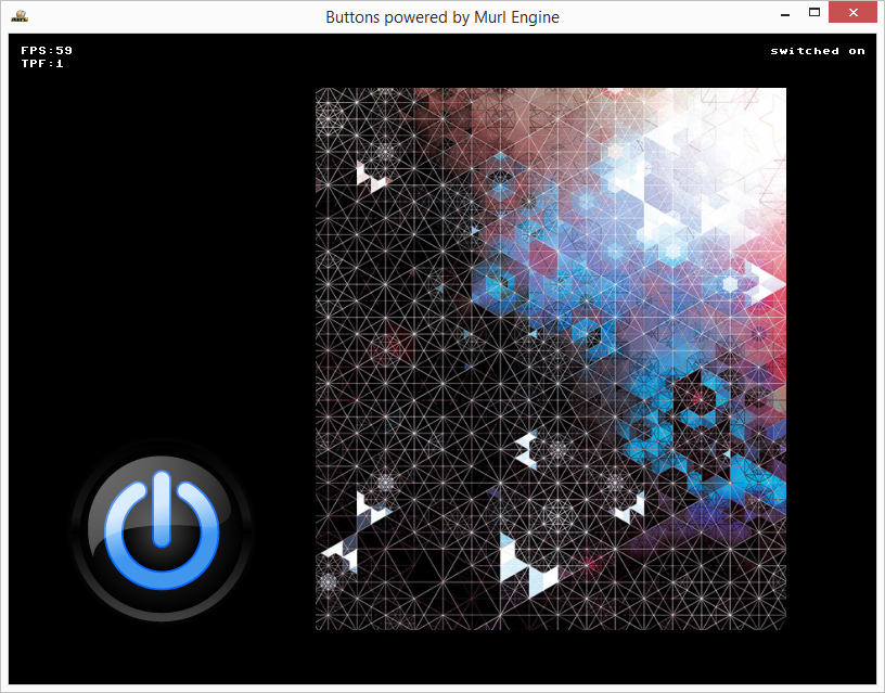
Version 3: Toggle Button & Multi Touch Events
Toggle Button
A toggle button is a button which can switch between two states (in addition to the already mentioned button states). That means it can either be turned on or turned off.
Since the on and off state shall be visualized with another appearance, the PlaneGeometry of the button needs to be changed depending on the desired state. This can simply be done with a Graph::Switch node.
A Switch node activates no or exactly one of its direct child nodes and ignores all other child nodes. The active child node can be set via the order index (index attribute) or via the id name (selectedChildId attribute).
For our toggle button we define a Switch node which can switch between powerbutton-disabled and powerbutton-up. For the different button states we always reference this Switch node. In order to avoid that the Switch node is rendered twice, we need to pack it into a node with the visible attribute set to false.
  <Transform id="transform01" posX="-259" posY="-159">
    <Button id="button" sizeX="182" sizeY="182" shape="ELLIPSE"
      upStateChildIndex="1" downStateChildIndex="2"
      hoverStateChildIndex="3" disabledStateChildIndex="4"
    >
      <Node visible="false">
        <Switch id="buttonState" index="0" >
          <Reference targetId="material/powerbutton-disabled"/>
          <Reference targetId="material/powerbutton-up"/>
        </Switch>
      </Node>
      <Reference targetId="buttonState"/>
      <Scale scaleFactor="0.9">
        <Reference targetId="buttonState"/>
      </Scale>
      <Reference targetId="buttonState"/>
      <Reference targetId="material/powerbutton-disabled"/>
    </Button>
  </Transform>
We define a Logic::SwitchNode member variable in the logic class and switch the Button state with mSwitch01->SetIndex().
    // Toggle-Button
    if (mButton->WasReleasedInside())
    {
        if (mButtonSwitch->GetIndex() != 0)
        {
            mButtonSwitch->SetIndex(0);
            state->SetUserDebugMessage("switched off");
        }
        else
        {
            mButtonSwitch->SetIndex(1);
            state->SetUserDebugMessage("switched on");
        }
    }
As a result we get a toggle button which can be turned on and off via a mouse click or a touch event. The current state of the button can be queried with mSwitch01->GetIndex() at any time.
Multi Touch Events
A Button node can not only be used for creating simple buttons, but also for more complex multi touch gesture controls. As a simple example we show a picture and allow zooming and moving via mouse and multi touch input devices.
As display image we use the picture Interstitia-andy-gilmore.jpg made by the US-American artist Andy Gilmore. Its resolution is 1280 x 1478 pixels, which is obviously no power of two resolution and can therefore lead to problems with older GPUs. For that reason, we create a scaled version having a valid power of two resolution with a graphic program – in our case the Interstitia-andy-gilmore-1024.jpg graphic having a resolution of 1024 x 1024 pixels.
In the file package.xml we define both graphic files as graphic resource and use the suitable picture depending on the feature availability. The ability of a GPU handling pictures which do not have a power of two resolution can be queried with includeForFeatures="FULL_NON_POWER_OF_TWO_TEXTURES".
- Note
- Hint: A list of all available
includeForXpreconditions can be found in the API documentation of theResource::Objectclass.
  <Resource id="gfx_picture" fileName="gfx/Interstitia-andy-gilmore.jpg" includeForFeatures="FULL_NON_POWER_OF_TWO_TEXTURES"/>
  <Resource id="gfx_picture" fileName="gfx/Interstitia-andy-gilmore-1024.jpg"/>
That way, different resources can be loaded for a given id depending on the currently available features. The first resource having all required features is processed while all other resources having the same id are ignored. A list of the individual features which can be queried can be found in the IEnums::Feature Enum.
It is also possible to combine individual features, e.g.:
<!-- Feature 1 and Feature 2 must be available to load gfx_1.png-->
<Resource id="gfx" fileName="gfx_1.png" includeForFeatures="1" includeForFeatures="2">
<!-- Feature 2 or Feature 3 must be available to load gfx_2.png-->
<Resource id="gfx" fileName="gfx_2.png" includeForFeatures="3">
<Resource id="gfx" fileName="gfx_2.png" includeForFeatures="4">
<!-- Fallback is gfx_3.png-->
<Resource id="gfx" fileName="gfx_3.png">
We create a FlatTexture node for the graphic resource in the graph_materials.xml file.
    <FlatTexture
      id="tex_gfx"
      imageResourceId="package_main:gfx_picture"
      pixelFormat="R8_G8_B8_A8"
      useMipMaps="false"
    />
In order to display the picture we use a PlaneGeometry with a size of 434x500 and for its control a Button node of the same size. We pack the PlaneGeometry node into a Switch node in order to be able to turn the display off with the already created toggle button.
  <MaterialState materialId="material/mat_texture"/>
  <TextureState textureId="material/tex_gfx"/>

    <Switch id="gfxState">
      <PlaneGeometry id="gfx"
        scaleFactorX="434" scaleFactorY="500"
        texCoordX1="0" texCoordY1="0"
        texCoordX2="1" texCoordY2="1"
        posX="100"
    />
    </Switch>

    <Button id="gfxButton" posX="100" sizeX="434" sizeY="500"/>
A Graph::Button node gives numerous possibilities for processing multi touch inputs.
The method GetNumberOfTrackedEvents() indicates how much touch events can currently be observed (number of fingers on the touch device). The maxNumberOfEvents attribute or the SetMaxNumberOfEvents(value) method can limit the maximum number of the reported touch events (fingers).
By using the GetTrackedEventId(trackedEventIndex) method we get a unique id for every current event.
The GetLocalEventPosition(id) and GetEventOutCoord(id) methods provide the corresponding touch position values for the given id.
The values of GetLocalEventPosition(id) are the local position on the button with the value 0/0 lying in the exact center of the button (analogous to GetEventPosition). The GetEventOutCoord(id) method delivers values between -1 and +1.
In our example we get the following values from GetLocalEventPosition for a button with a size of 434 x 500 pixels:
We declare suitable member variables and methods in the header file. By using the enum GfxState and the mGfxState variable we then create a simple state machine in order to switch between idling, moving and zooming. The mGfxCoordX1, mGfxCoordY1, mGfxCoordX2, mGfxCoordY2 variables are used to save the currently displayed area. In the mTrackedEventPositions map we save the coordinates of the events together with their event id.
    enum GfxState
    {
        STATE_IDLE = 0,
        STATE_DRAGGING,
        STATE_ZOOMING,
    };
    void SetGfxCoords(Double x1, Double y1, Double x2, Double y2);
    void ZoomGfx(Double zoomFactor);
    void DoIdle();
    void DoDrag();
    void DoZoom();

    GfxState mGfxState;
    Double mGfxCoordX1, mGfxCoordX2, mGfxCoordY1, mGfxCoordY2;
    Map<UInt32, Graph::Vector> mTrackedEventPositions;

    Murl::Logic::ButtonNode mButton;
    Murl::Logic::SwitchNode mButtonSwitch;

    Murl::Logic::PlaneGeometryNode mGfx;
    Murl::Logic::SwitchNode mGfxSwitch;
    Murl::Logic::ButtonNode mGfxButton;
The Double member variables are initialized in the constructor.
App::ButtonsLogic::ButtonsLogic(Logic::IFactory* factory)
: BaseProcessor(factory),
mGfxState(STATE_IDLE),
mGfxCoordX1(0),
mGfxCoordY1(0),
mGfxCoordX2(1),
mGfxCoordY2(1)
{
}
A reference to the graph nodes is created in the OnInit method.
    AddGraphNode(mGfx.GetReference(root, "gfx"));
    AddGraphNode(mGfxButton.GetReference(root, "gfxButton"));
    AddGraphNode(mGfxSwitch.GetReference(root, "gfxState"));
In the method OnProcessTick we use the toggle button in order to turn the picture view on and off. Additionally, we reset the display area with SetGfxCoords(0,0,1,1) to a predefined area when switched on.
    // Toggle-Button
    if (mButton->WasReleasedInside())
    {
        if (mButtonSwitch->GetIndex() != 0)
        {
            mButtonSwitch->SetIndex(0);
            mGfxSwitch->SetIndex(-1);
            state->SetUserDebugMessage("switched off");
        }
        else
        {
            mButtonSwitch->SetIndex(1);
            mGfxSwitch->SetIndex(0);
            SetGfxCoords(0,0,1,1);
            state->SetUserDebugMessage("switched on");
        }
    }
Optionally, we allow zooming via mouse wheel as well. The GetRawWheelDelta method provides the value changes of the mouse wheel.
    // Mouse-Wheel
    if (deviceHandler->IsMouseAvailable())
    {
        Graph::Real deltaX = 0;
        Graph::Real deltaY = 0;
        deviceHandler->GetRawWheelDelta(deltaX, deltaY);
        if (deltaY != 0)
        {
            ZoomGfx(deltaY);
        }
    }
As a last step, we call the corresponding method on every process tick depending on the state variable mGfxState.
  // Switch gfx States
  switch (mGfxState)
  {
  case STATE_IDLE:
      DoIdle();
      break;
  case STATE_DRAGGING:
      DoDrag();
      break;
  case STATE_ZOOMING:
      DoZoom();
      break;
  default:
      break;
  }
The STATE_IDLE state checks how many button touch events exist. At one event the state is changed into STATE_DRAGGING, at two or three into STATE_ZOOMING. Switching the state is carried out only if at least one finger moves for more than 16 entities (dead zone). To do so, we save the position values for every event in mTrackedEventPositions and compare them with the current position values.
void App::ButtonsLogic::DoIdle()
{
    // remove stored but no longer tracked ids
    for (SInt32 i = 0; i < mTrackedEventPositions.GetCount(); i++)
    {
        if (!mGfxButton->IsEventTracked(mTrackedEventPositions.GetKey(i)))
        {
            mTrackedEventPositions.Remove(i);
            i--;
        }
    }

    // add new ids or check distance of existing ids
    UInt32 numEvents = mGfxButton->GetNumberOfTrackedEvents();
    for (UInt32 i = 0; i < numEvents; i++)
    {
        UInt32 id = mGfxButton->GetTrackedEventId(i);
        SInt32 index = mTrackedEventPositions.Find(id);

        if (index < 0)
        {
            mTrackedEventPositions.Add(id, mGfxButton->GetLocalEventPosition(id));
        }
        else
        {
            Graph::Vector diff = mGfxButton->GetLocalEventPosition(id) - mTrackedEventPositions[index];
            if (diff.GetLength() > Real(16.0))
            {
                if (numEvents == 1)
                    mGfxState = STATE_DRAGGING;
                else
                    mGfxState = STATE_ZOOMING;
            }
        }
    }
}
The STATE_DRAGGING state reads the position values of the event and the display area is moved accordingly. This state is changed into STATE_IDLE, if the number of upcoming touch events does not equal 1.
void App::ButtonsLogic::DoDrag()
{
    // drag ends
    if (mGfxButton->GetNumberOfTrackedEvents() != 1)
    {
        mTrackedEventPositions.Empty();
        mGfxState = STATE_IDLE;
        return;
    }

    UInt32 id = mGfxButton->GetTrackedEventId(0);
    const Graph::Vector& pos = mGfxButton->GetLocalEventPosition(id);
    Double deltaX = (mTrackedEventPositions[0].x - pos.x) * (mGfxCoordX2 - mGfxCoordX1) / 434;
    Double deltaY = (mTrackedEventPositions[0].y - pos.y) * (mGfxCoordY2 - mGfxCoordY1) / 500;
    SetGfxCoords(mGfxCoordX1 + deltaX, mGfxCoordY1 - deltaY, mGfxCoordX2 + deltaX,    mGfxCoordY2 - deltaY);
    mTrackedEventPositions[0] = pos;
}
Analogously, the state STATE_ZOOMING reads the position values of the first two events and calculates the zoom factor which is then passed onto the ZoomGfx method. The state changes into STATE_IDLE, if the number of upcoming touch events is less than 2.
void App::ButtonsLogic::DoZoom()
{
    // zoom ends
    if (mGfxButton->GetNumberOfTrackedEvents() < 2)
    {
        mTrackedEventPositions.Empty();
        mGfxState = STATE_IDLE;
        return;
    }

    Graph::Vector oldDiff = mTrackedEventPositions[0] - mTrackedEventPositions[1];

    UInt32 id0 = mGfxButton->GetTrackedEventId(0);
    mTrackedEventPositions[0] = mGfxButton->GetLocalEventPosition(id0);
    UInt32 id1 = mGfxButton->GetTrackedEventId(1);
    mTrackedEventPositions[1] = mGfxButton->GetLocalEventPosition(id1);
    Graph::Vector newDiff = mTrackedEventPositions[0] - mTrackedEventPositions[1];
    ZoomGfx((newDiff.GetLength()-oldDiff.GetLength())/100);
}
The ZoomGfx method calculates the window center and window size from the current display area. These values are then increased or decreased according to the zoomFactor. The Math::Clamp method ensures that the values for the display area are always in a pre-defined area.
- Note
- In this implementation zooming takes always place around the display area's center and not around the center of the touch events.
void App::ButtonsLogic::ZoomGfx(Double zoomFactor)
{
  Double scx = (mGfxCoordX1 + mGfxCoordX2) * 0.5;
  Double scy = (mGfxCoordY1 + mGfxCoordY2) * 0.5;
  Double scaleFactorX = Math::Abs(mGfxCoordX2 - mGfxCoordX1);
  Double newSize = scaleFactorX*(1-zoomFactor*0.2)/2;
  newSize = Math::Clamp(newSize, 0.05, 10.0);
  SetGfxCoords(scx - newSize, scy - newSize, scx + newSize, scy + newSize);
}
As a result, we get a toggle button and an image which can be increased, decreased and moved via mouse and multi touch.
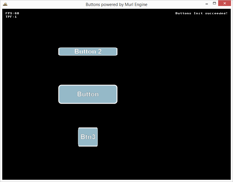
Version 4: Text Button & 9-Slice-Scaling
As last example we create a simple reusable button with text.
Text Button
As already done in Version 2: Enhanced Button, we create images for button states, set up a texture atlas with the Atlas Generator and store the generated files in the sub directory main.murlres/button.
As a next step we create a sub graph within the graph_init_button.xml file. This sub graph defines all necessary materials and planes. All buttons are then able to reference these nodes.
All nodes are wrapped in the ressource_button namespace. The textCoord values for the PlaneGeometry nodes are taken from the generated planes_button.xml file. The planes_button.xml file is no longer required and may therefore be deleted.
<?xml version="1.0"?>

<Graph materialId="/material/mat_alpha_texture" imageResourceId="package_main:gfx_button">
  <Namespace id="ressource_button" activeAndVisible="no">
    <FlatTexture
          id="tex"
          imageResourceId="{imageResourceId}"
          pixelFormat="R8_G8_B8_A8"
          useMipMaps="false"
    />
    <Node id="mat">
      <MaterialState materialId="{materialId}"/>
      <TextureState textureId="tex"/>
    </Node>
    <PlaneGeometry id="button_disabled" depthOrder="10" texCoordX1="0.000000000000" texCoordX2="0.414062500000" texCoordY1="0.000000000000" texCoordY2="0.281250000000"/>
    <PlaneGeometry id="button_down"     depthOrder="10" texCoordX1="0.000000000000" texCoordX2="0.414062500000" texCoordY1="0.281250000000" texCoordY2="0.562500000000"/>
    <PlaneGeometry id="button_hover"    depthOrder="10" texCoordX1="0.000000000000" texCoordX2="0.414062500000" texCoordY1="0.562500000000" texCoordY2="0.843750000000"/>
    <PlaneGeometry id="button_up"       depthOrder="10" texCoordX1="0.414062500000" texCoordX2="0.828125000000" texCoordY1="0.000000000000" texCoordY2="0.281250000000"/>
  </Namespace>
</Graph>
The sub graph for the button is defined in the graph_button.xml file. We first set the suitable material and draw the button afterwards. In order to display text we use a TextGeometry node.
- Note
- Hint: The text size of a
TextGeometrynode can be automatically fitted. Without automatic fitting a longer text may protrude the button image. In order to avoid this, the attributesenableContainerFitting="true",containerSizeXandcontainerSizeYcan be used to get a proper font size adjustment automatically.
All nodes are wrapped into a Namespace in order to avoid any problems regarding the id names (as they need to be unique). Additionally, the SubState node ensures that the changed material is reset to the initial values.
<?xml version="1.0" ?>

<Graph posX="0" posY="0" posZ="0" axisX="0" axisY="1" axisZ="0" angle="0 deg"
       sizeX="210" sizeY="70" passEvents="no" shape="RECTANGLE" fontSize="24" text="Button">
  <Namespace id="{buttonId}">
    <SubState>
      <Reference targetId="/ressource_button/mat"/>
      <Transform posX="{posX}" posY="{posY}" posZ="{posZ}" axisX="{axisX}" axisY="{axisY}" axisZ="{axisZ}" angle="{angle}">
        <!-- Button -->
        <Scale scaleFactorX="{sizeX}" scaleFactorY="{sizeY}">
          <Button id="button"
                  shape="{shape}"
                  passEvents="{passEvents}"
                  upStateChildIndex="0" downStateChildIndex="1" hoverStateChildIndex="2" disabledStateChildIndex="3" >
            <Reference targetId="/ressource_button/button_up"/>
            <Reference targetId="/ressource_button/button_down"/>
            <Reference targetId="/ressource_button/button_hover"/>
            <Reference targetId="/ressource_button/button_disabled"/>
          </Button>
        </Scale>
        <!-- Text Geometry -->
        <TextGeometry id="text"
          depthOrder="11"
          systemFontName="SansBold"
          fontSize="{fontSize}"
          textColor="255i, 255i, 255i, 255i"
          backgroundColor="0i, 0i, 0i, 0i"
          text="{text}"
        />
      </Transform>
    </SubState>
  </Namespace>
</Graph>
The files are specified in the package definition.
  <!-- Button resources -->
  <Resource id="gfx_button" fileName="button/gfx_button.png"/>
  <Resource id="init_button" fileName="button/graph_init_button.xml"/>
  <Resource id="graph_button" fileName="button/graph_button.xml"/>
In the graph_main.xml file it is possible to easily instantiate several buttons.
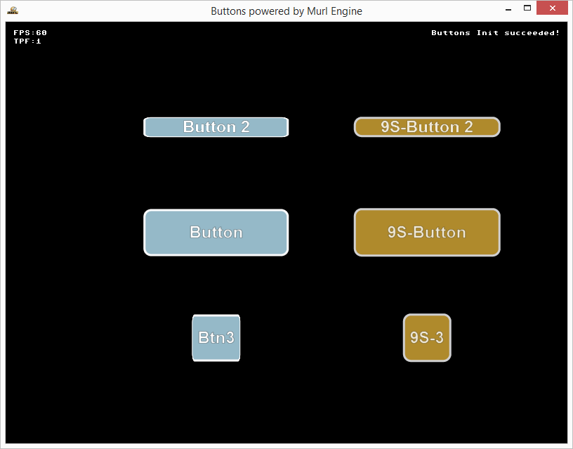
  <!--Create Button Ressource Instance-->
  <Instance graphResourceId="package_main:init_button"/>

  <!--Draw Buttons-->
  <Instance graphResourceId="package_main:graph_button" buttonId="button01" posX="-100"/>
  <Instance graphResourceId="package_main:graph_button" buttonId="button02" posX="-100" posY="150" sizeY="30" text="Button 2"/>
  <Instance graphResourceId="package_main:graph_button" buttonId="button03" posX="-100" posY="-150" sizeX="70" sizeY="70" text="Btn3"/>
As a result, we get three buttons on the screen.
In this implementation, also the width of the border and the edge radius are scaled with the button. If this is not desired, the 9 patch technique (also 9 slice technique) may be a solution.
9 Patch Text Button
With the 9 patch technique a graphic is split into 9 parts through two vertical and two horizontal axes. If the button is then scaled, the parts 1, 3, 7 and 9 are not scaled, the parts 4 and 6 only vertically and the parts 2 and 8 only horizontally. Part 5 is scaled horizontally and vertically. Hence the thickness of the border line and the proportion of the corner parts stay intact.
For the 9 patch technique we need a Graph::NinePatchPlaneGeometry node. The capTexCoordSizeX1, capTexCoordSizeY1, capTexCoordSizeX2, capTexCoordSizeY2 attributes define the axis position for the division of the texture. The capCoordSizeX1, capCoordSizeY1, capCoordSizeX2, capCoordSizeY2 attributes define the axis position for the division of the plane. The individual texture parts are then mapped onto the according plane parts.
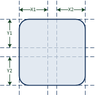
For the button we create an image with a size of 32x32 pixels. The positions of the separating axes should be 15 pixel away from the margin. With a 1:1 mapping between texture and plane our Graph::NinePatchPlaneGeometry node should look like this:
<NinePatchPlaneGeometry id="geometry"
  depthOrder="10"
  frameSizeX="210" frameSizeY="70"

  textureSizeX="32" textureSizeY="32"
  texCoordX1="0" texCoordY1="0"
  texCoordX2="32" texCoordY2="32"
  capTexCoordSizeX1="15" capTexCoordSizeX2="15"
  capTexCoordSizeY1="15" capTexCoordSizeY2="15"

  capCoordSizeX1="15" capCoordSizeX2="15"
  capCoordSizeY1="15" capCoordSizeY2="15"
/>
The textureSizeX and textureSizeY attributes define a value range of 0–32 for X and Y instead of the default value range of 0–1. The texCoordX/Y/1/2 attributes define the texture section to be used. For our example, the whole texture is used. The capTexCoordSizeX/Y/1/2 attributes define the separation axes for the texture. The capCoordSizeX/Y/1/2 attributes define the separation axes for the planes. As the values are the same, we get a pixel-precise mapping of 1:1 for the corner parts.
It is also possible to omit the textureSizeX/Y and texCoordX/Y/1/2 attributes by directly defining the capTexCoordSizeX/Y/1/2 values for the value range of 0–1:
  capTexCoordSizeX1="0.46875" capTexCoordSizeX2="0.46875"
  capTexCoordSizeY1="0.46875" capTexCoordSizeY2="0.46875"
Instead of defining a graphic for each button state as before, we may also change the state with modified color parameters. Our button sub graph will then look like this:
<?xml version="1.0" ?>

<Graph posX="0" posY="0" posZ="0" axisX="0" axisY="1" axisZ="0" angle="0 deg"
       sizeX="210" sizeY="70" passEvents="no" shape="RECTANGLE" fontSize="24" text="9S-Button">
  <Namespace id="{buttonId}">
    <SubState>
      <!-- Material -->
      <Reference targetId="/ressource_button_9s/mat"/>
      <!-- Geometry -->
      <Node activeAndVisible="no">
        <NinePatchPlaneGeometry id="geometry"
          depthOrder="10"
          frameSizeX="{sizeX}" frameSizeY="{sizeY}"

          textureSizeX="32" textureSizeY="32"
          texCoordX1="0" texCoordY1="0"
          texCoordX2="32" texCoordY2="32"
          capTexCoordSizeX1="15" capTexCoordSizeX2="15"
          capTexCoordSizeY1="15" capTexCoordSizeY2="15"

          capCoordSizeX1="15" capCoordSizeX2="15"
          capCoordSizeY1="15" capCoordSizeY2="15"
          allowDynamicBatching="yes"
        />
      </Node>
      <Transform posX="{posX}" posY="{posY}" posZ="{posZ}" axisX="{axisX}" axisY="{axisY}" axisZ="{axisZ}" angle="{angle}">
        <!-- Button -->
        <Button id="button"
                sizeX="{sizeX}" sizeY="{sizeY}"
                shape="{shape}"
                passEvents="{passEvents}"
                upStateChildIndex="0" downStateChildIndex="1" hoverStateChildIndex="2" disabledStateChildIndex="3" >
          <Node>
            <ParametersState parametersId="/ressource_button_9s/param_button_up"/>
            <Reference targetId="geometry"/>
          </Node>
          <Node>
            <ParametersState parametersId="/ressource_button_9s/param_button_down"/>
            <Reference targetId="geometry"/>
          </Node>
          <Node>
            <ParametersState parametersId="/ressource_button_9s/param_button_hover"/>
            <Reference targetId="geometry"/>
          </Node>
          <Node>
            <ParametersState parametersId="/ressource_button_9s/param_button_disabled"/>
            <Reference targetId="geometry"/>
          </Node>
          <!-- Text Geometry -->
          <TextGeometry id="text"
            depthOrder="11"
            systemFontName="SansBold"
            fontSize="{fontSize}"
            textColor="255i, 255i, 255i, 255i"
            backgroundColor="0i, 0i, 0i, 0i"
            text="{text}"
          />
        </Button>
      </Transform>
    </SubState>
  </Namespace>
</Graph>
The referenced parameters are defined in a common resource file which is shared for all instances.
<?xml version="1.0"?>

<Graph materialId="/material/mat_alpha_color_texture" imageResourceId="package_main:gfx_button_9s">
  <Namespace id="ressource_button_9s" activeAndVisible="no">
    <FlatTexture
          id="tex"
          imageResourceId="{imageResourceId}"
          pixelFormat="R8_G8_B8_A8"
          useMipMaps="false"
    />
    <Node id="mat">
      <MaterialState materialId="{materialId}"/>
      <TextureState textureId="tex"/>
    </Node>

    <FixedParameters id="param_button_up"       diffuseColor="D0ffffffh"/>
    <FixedParameters id="param_button_down"     diffuseColor="80ffffffh"/>
    <FixedParameters id="param_button_hover" />
    <FixedParameters id="param_button_disabled" diffuseColor="40ffffffh"/>

  </Namespace>
</Graph>
Again it is possible to easily instantiate several buttons in the graph_main.xml file.
  <!--Create Button Ressource Instance-->
  <Instance graphResourceId="package_main:init_button_9s"/>

  <!--Draw Buttons-->
  <Instance graphResourceId="package_main:graph_button_9s" buttonId="9sbutton01" posX="200"/>
  <Instance graphResourceId="package_main:graph_button_9s" buttonId="9sbutton02" posX="200" posY="150" sizeY="30" text="9S-Button 2"/>
  <Instance graphResourceId="package_main:graph_button_9s" buttonId="9sbutton03" posX="200" posY="-150" sizeX="70" sizeY="70" text="9S-3"/>
As a result we get three additional buttons which scale nicely with the 9 patch technique.
NinePatchPlaneSequenceGeometry
If the image is part of a larger texture atlas, the NinePatchPlaneSequenceGeometry node can be used for rendering.
We create the XmlAtlas file with the Atlas Generator (see also Tutorial #02: Atlas Demo). In the configuration file, we set the createNames attribute for the AtlasXML to TRUE. This allows us later to simply reference the image by its name.
<AtlasGenerator xmlns="http://murlengine.com">
    <Input path="../data/orig/ui_skin">
      <Matte color="0i, 0i, 0i"/>
      <Crop cropThreshold="1i" />
      <Image names="*"/>
    </Input>

    <Output path="../data/packages/main.murlres">
        <Atlas sizeRaster="2"/>
        <Image name="gfx_gui.png" margin="8"/>
        <AtlasXML name="atlas_gui.xml" createNames="TRUE" textureSlots="1" materialSlot="4"/>
    </Output>
</AtlasGenerator>
The created atlas file contains rectangles with names for all images in the atlas.
<?xml version="1.0" encoding="utf-8"?>
<!-- Auto created by atlas_generator -->
<Atlas xmlns="http://murlengine.com">
  ...
  <Rectangle name="button_primary" materialSlot="4" textureSlots="1" coordSizeX="224" coordSizeY="84" texCoordX1="0.8681640625" texCoordY1="0" texCoordX2="0.9775390625" texCoordY2="0.08203125"/>
  <Rectangle name="button_secondary" materialSlot="4" textureSlots="1" coordSizeX="218" coordSizeY="82" texCoordX1="0.5078125" texCoordY1="0.6640625" texCoordX2="0.6142578125" texCoordY2="0.744140625"/>
  ...
</Atlas>
We reference the rectangle with the attributes atlasResourceId and rectangleName. The attributes capTexCoordSizeX1/X2/Y1/Y2 are again used to define the axis position for the division of the texture. We can omit the attributes capCoordSizeX1/X2/Y1/Y2 if the values are identical to the values of capTexCoordSizeX1/X2/Y1/Y2.
    <NinePatchPlaneSequenceGeometry
        id="button_primary_ninepatch"
        atlasResourceId="package_main:atlas_gui"
        rectangleName="button_primary"
        frameSizeX="500" frameSizeY="84"
        capTexCoordSizeX1="36" capTexCoordSizeX2="36" capTexCoordSizeY1="0" capTexCoordSizeY2="0"
    />